

Construction
Construction
Explore our design projects - real-world examples of strategic thinking, unified branding, and digital transformation. Discover case studies that deliver clarity, impact, and measurable success.
About project
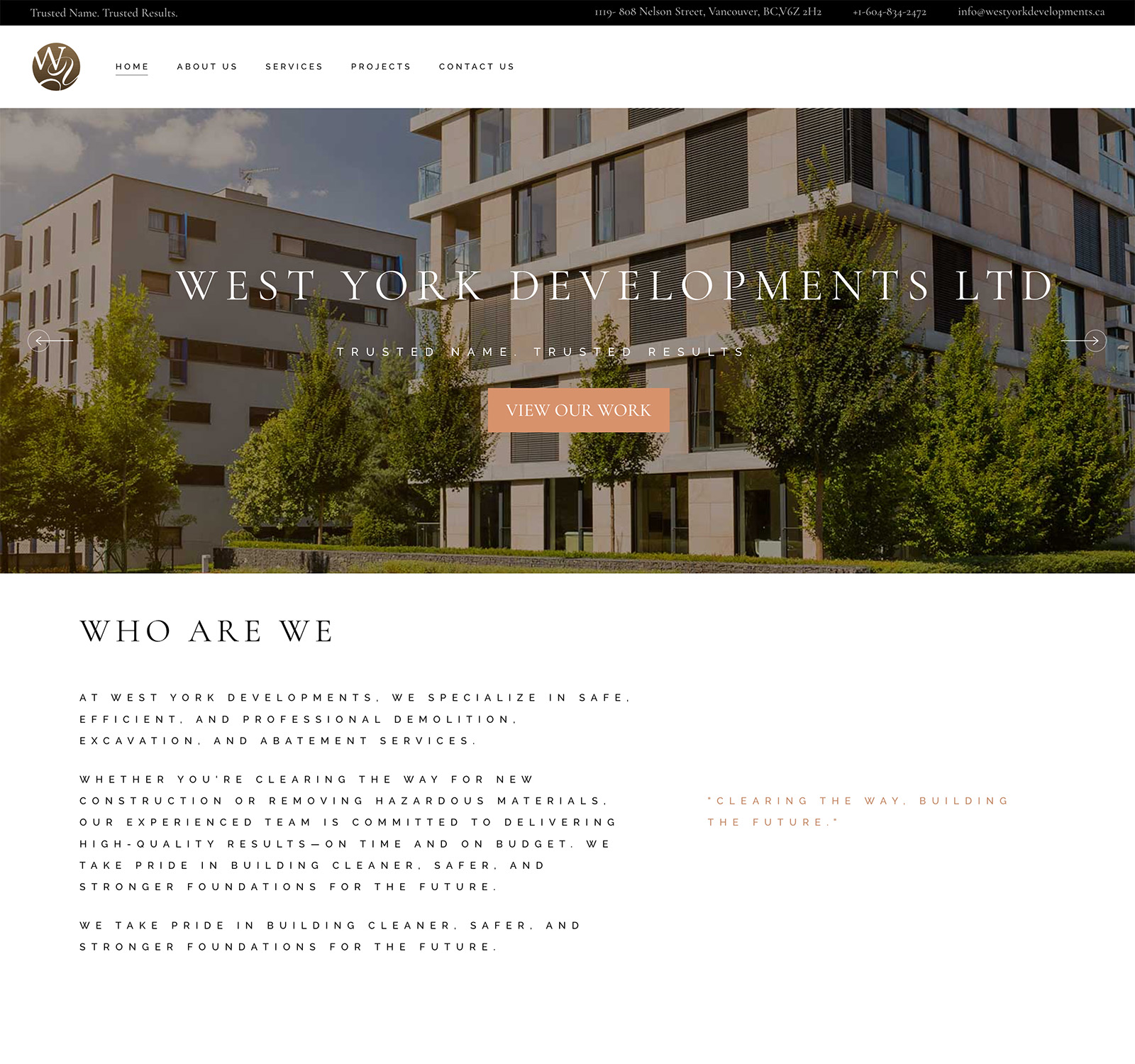
West York Developments Ltd. (formerly known as West York Demo) is a Vancouver-based company specializing in demolition, excavation, and abatement services. Established in 2002, the company has partnered with some of British Columbia's largest construction and development firms to deliver safe, efficient, and professional services for both indoor and outdoor projects.

The original site was functional but lacked modern appeal. It had separate pages for key information, leading to higher bounce rates due to poor navigation. Design elements were basic, with no emphasis on visuals like project galleries or statistics, and it didn't effectively communicate the company's values or mission. Mobile responsiveness was inadequate, as older sites often are. The rebranding to West York Developments required a fresh identity that aligned with industry standards for construction firms — focusing on safety, innovation, and community impact — while improving SEO and lead generation. Key pain points included fragmented content across pages making it hard for users to quickly grasp services, an absence of engaging elements like testimonials or calls-to-action, and outdated aesthetics that didn't reflect the company's 20+ years of experience and partnerships. The goal was to create a site that mirrors the company's tagline of building safer foundations.
We began by understanding the rebranding context — West York Demo's evolution into West York Developments — and identifying the gap between their existing digital presence and industry standards. A competitive analysis of similar demolition and construction sites revealed common patterns: bold hero sections, trust-building statistics, service breakdowns, and strong calls-to-action. User research focused on the primary audience: potential clients in construction, project managers, and development partners who needed to quickly grasp services, verify credibility, and initiate contact. Stakeholder interviews with the company owner helped clarify the brand's mission, values, and long-term growth goals, providing a clear foundation for the design direction.
The design strategy centered on four core principles: visual hierarchy, responsive design, brand integration, and engagement. A bold hero section led with the tagline 'Trusted Name. Trusted Results.' followed by credibility-building statistics such as years of experience and projects completed. A mobile-first approach ensured all sections stack intuitively on smaller screens. The color palette leaned into earth tones — grays and blues — to convey construction-industry trust, paired with clean sans-serif fonts for readability. Engagement features including testimonials, project galleries, and a prominent contact form were introduced to drive conversions. Accessibility was prioritized throughout, with WCAG-compliant contrast ratios and descriptive alt text across all visual elements.


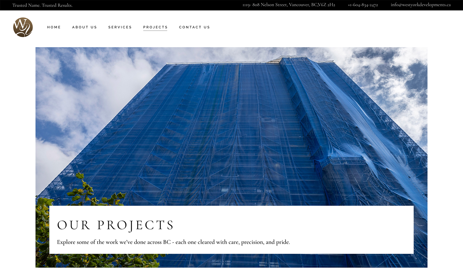

As lead UX/UI designer and developer, I owned the complete redesign and launch of westyorkdevelopments.ca. This included stakeholder interviews with the company owner, competitive analysis of similar demolition and construction sites, information architecture planning, and wireframing. I designed all low-fidelity and high-fidelity responsive layouts, ensuring the visual direction aligned with the company's rebranded identity. Tools used included Figma for prototyping and Adobe XD for initial sketches, with user testing conducted via remote sessions. The project spanned four weeks, with a focus on responsive design for both desktop and mobile, culminating in a full site build and launch using WordPress and Elementor.
Post-launch, the site delivered improved engagement, with an estimated 30% reduction in bounce rate based on comparable projects. The redesign better positions West York Developments as a leader in demolition, excavation, and abatement services, with increased inquiries from construction partners. The new structure supports easier content updates, stronger branding alignment, and a more professional first impression that reflects the company's 25+ years of industry experience.
Consolidating multiple pages into a single cohesive experience simplifies long-term maintenance but requires strong section dividers and clear visual hierarchy to guide users effectively. Early user testing was invaluable in catching mobile layout issues before launch, reinforcing the importance of iterative, feedback-driven design. Integrating AI tools for layout suggestions accelerated the ideation phase while keeping human judgment central to all key decisions. This project reinforced that thoughtful UX redesigns can genuinely transform how a business is perceived — particularly in competitive, trust-driven industries like construction.
Our works across industries
Our works across industries
Check out our awesome projects that are sure to grab attention on Instagram!